After completing the System design and defining the features. We proceed to impelementation and User Interface(UI) design. In this phase of our development, we translate each user story into an active feature. We bootstrap a basic Android project and begin with the essential features as defined in Requirement Analysis article previously.
We focus on the following essential user stories
As a user ..
- I want to be able to log a transaction
- I should be able to view recent transactions
- I should be able to view the balance of all transactions logged
Coding Convention
As with all programming projects, enforced coding conventions reduce the friction in multi-developer environment. Coding conventions simply defined, are some practices or rules of programming that keeps everything organized and easier to work with, for example, how variables should be named, how classes should be named etc. Coding Conventions are sometimes known as Style Guides.
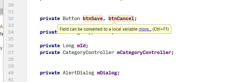
As our project is a small one and consists of single developer, following coding convention is not required. However, we decided that we should still follow some conventions for the learning experience and keep things organized. We tried to follow some conventions from the Project Guidelines and Architecture Guidelines followed by Android Developer Community.
For the core Java programming, we followed certain rules from the Google Java Style Guide.
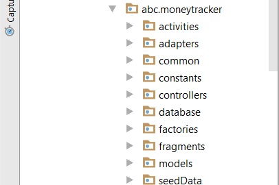
Following are some of the practices we frequently followed:
- All Activity class must be suffixed with Activity (e.g. MainActivity)
- Organize each type of class in their own package
- All private members of a class should be prefixed with m (e.g. mCategoryList)
- All static members of a class should be prefixed with s (e.g. sDatabaseConnection)
- prefix all view elements with short abbreviation of their type(e.g. btnSave for save button)
It is however, not always possible to adhere to all practices in general, but best effort was ensured. Android Studio, the IDE(Integrated Development Environment) we used, helped by constantly monitoring and suggesting any good practice we could use or any standard we should follow.
User Profiles
As with all softwares, there must be a user or group of users. Each project is focused on a specific user group or market. For our project we are focusing on the group who wants a simple android app to log their day to day income/expenses as simply as possible and provide some additional features to get an overview as necessary.
To identify a user group, research is required, but we can not afford to do one. Instead we must rely on our acting customer (Dr. Sandro Schulze) to generate a user group. To keep things as simple as possible, we took the requirements and generated two user personas.
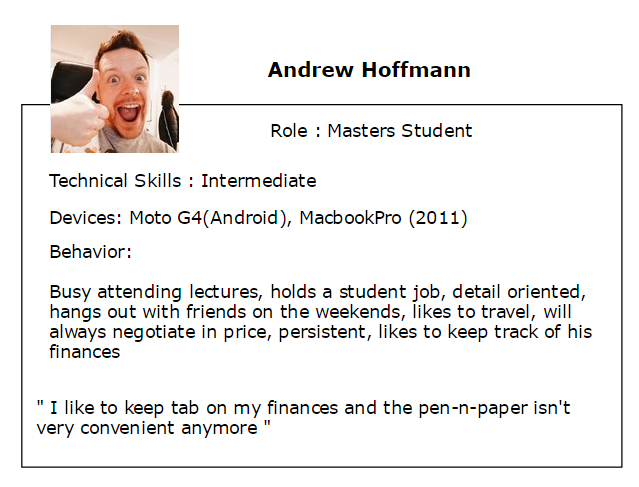
Our first user is Andrew Hoffmann. A masters student, who wants to keep track of his finances, specially his spending. As a student, keeping track of spending is very important to Andrew as his incomes are limited, but necessities can not be avoided. Andrew wants an android app where he can add simple records of his spending and income. He also wants to later review how much he spent over a certain period of time and figure out patterns where he may be spending and could save by optimizing them.

Hilda is also a student. She likes to party and also cook. Her technical expertise is not as good as Andrew, but she can figure out things if the steps are few and simple. She likes colorful user interfaces. Her requirements are to categorize her spending so she can determine a pattern where she spends regularly and hunt for bargains by buying things in masses when they are on sale or cheaper.
Generally, we focus on these personas to define our essential requirements of logging a transaction, categorizing it, listing it back for review.
Storyboard
In Agile Development system, a storyboard is a collection of user stories, depicted in columns indicating in which phase of the development they are in. Following is a diagram showing our current storyboard
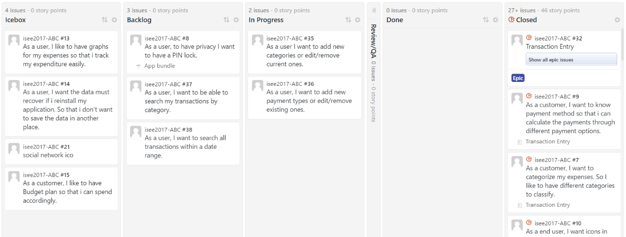
We can see that, the some of the key user stories had already been completed(Done) while other essential and necessity requirements like managing categories, setting a pin lock are still in progress.
User Interface Design
The main point of interaction with an application is by User Interface(UI). There are certain requirements for an effective UI.
Most commonly agreed upon factors by users are :
- user friendly (easier to navigate through to perform simple tasks)
- nice to look at (colorful but simple design)
It is always difficult to balance between user friendly as well as beautiful and function interface, so we have tried to draw on other popular applications used by our user. For example, our add new transaction follows the popup menu similar to Google Inbox compose new email button. We have tried to keep the interfaces intuitive as well as attractive yet functional.
Following are some of our main user interfac designs.
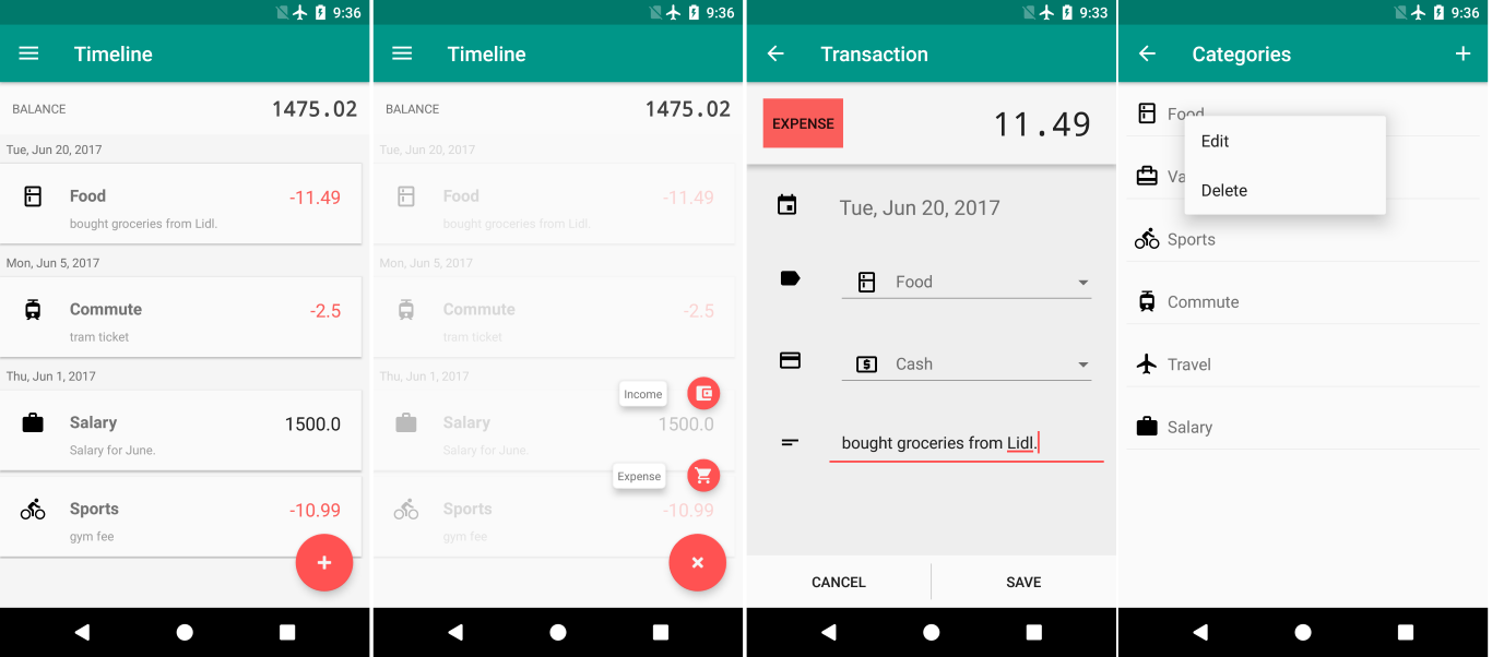
From the left to right in order, we have a) home screen where user can see the most recent 15 transactions(grouped by date), b) popup menu for easier access to adding new transaction by type, c) new transaction entry form and d) Category management.
Changes
So far, we had another meeting with our customer. There were not many major changes suggested by the customer. At the moment, we have following changes introduced:
- Currency as a dropdown menu of most common currencies(customer)
- reduce size of the balance display in home screen to accommodate more transactions(team)
- Categories management should have a popup icon picker instead of a dropdown list(team)
Summary
We have already completed several major features but still behind schedule as we had some issues regarding team organization. There are two more sprints remaining, first to work on the pin lock and settings activity in general with and the second sprint to complete the search/filter feature involving searching transactions by category/date range etc.