Hello Everyone! Welcome to our third blog, hope you enjoyed our second blog!!. Over the past few weeks we have been working out on our project with respect to the System Design. With respect to all the user stories which we have mentioned in our previous blog, we have come up with the following Interaction Diagrams and Class Diagrams which would help you all understand our project in a better way. We Shall be discussing about the Development strategies as well.
Interaction Diagrams
The purpose of the Interaction Diagram is
-
To capture the dynamic behaviour of the system
-
To describe the message flow in the system
-
To describe the structural organization of the objects
-
To describe the interaction among objects
Keeping all the above points into consideration, we have come up with the below Sequence Diagrams for two of the user stories.
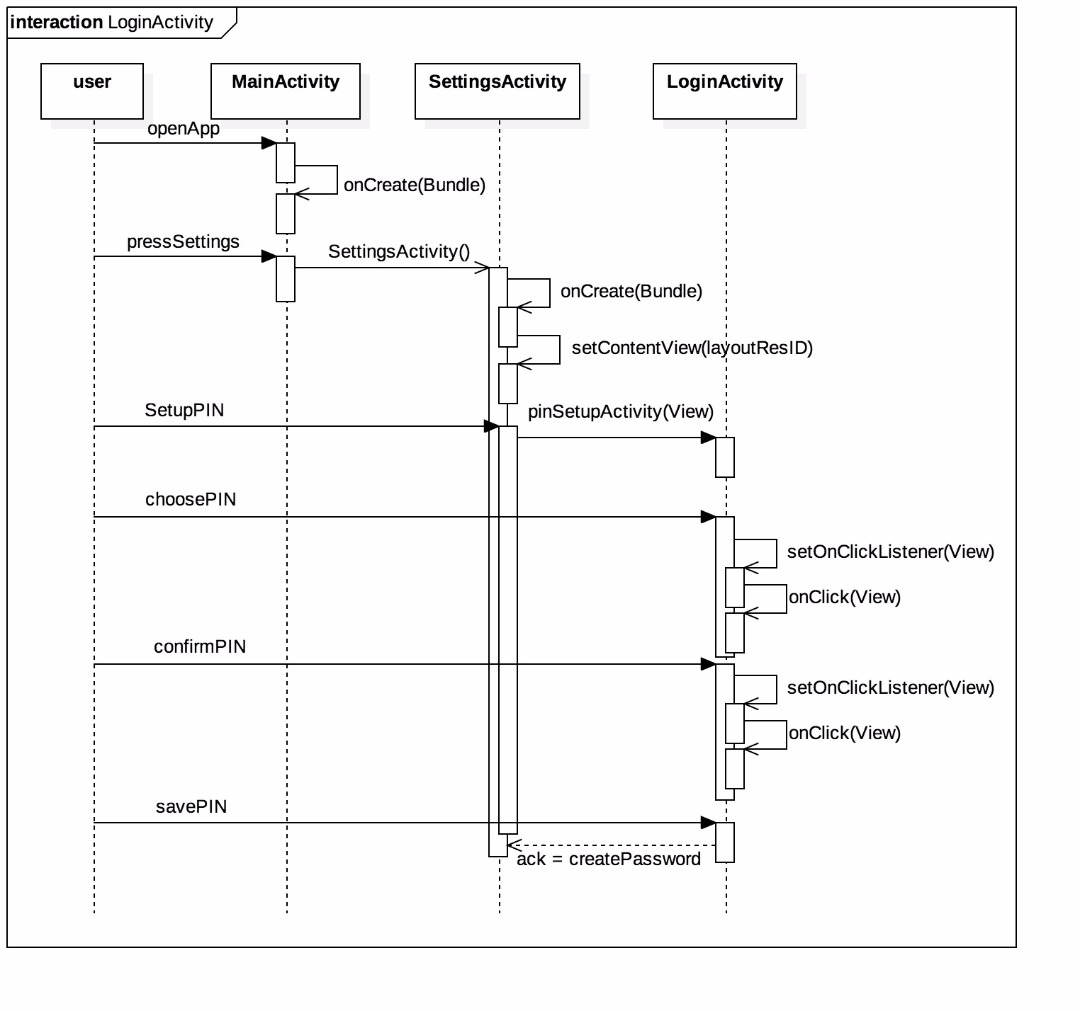
Sequence Interaction Diagram for Login Activity
Following diagram shows the sequence diagram for Login Activity. The user opens the App and the main page is displayed. Settings is available as part of the menu button and when the user clicks it then we navigate to Settings Activity page. In the Settings Activity page we have provided the user with “setupPIN” and when the user clicks it then Login Activity page will be shown where the user can choose the PIN and confirm the PIN and then he can save the PIN. The following sequence diagram shows all the corresponding user actions and the respective methods that are being invoked during this period.
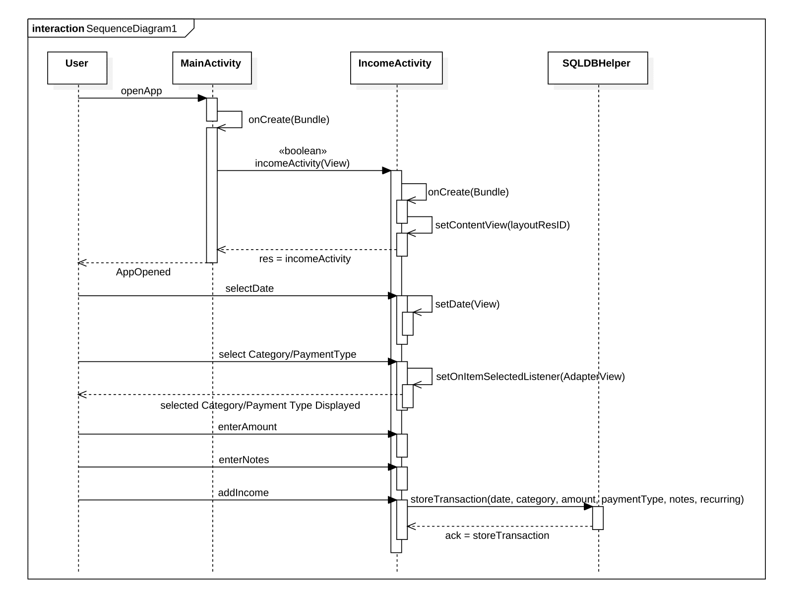
Sequence Interaction Diagram for Income Transaction
Following diagram depicts the sequence diagram for Income Transaction. When the user opens the App, In the main page “Income” button will be available. The user can click the button to add the Income transaction. When the user clicks the button, it will invoke the Income Activity page where user can enter the details of the transaction i.e., Date, Category Type, Payment Type, Amount, Notes etc., and then he can save the transaction details of the Income Activity. The following sequence diagram shows all the corresponding user actions and the respective methods that are being invoked during this period.
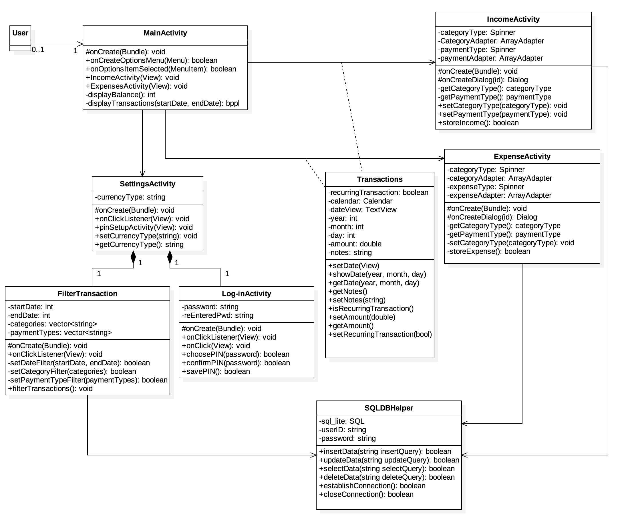
Class Diagram
MainActivity - Attributes

MainActivity - Methods

IncomeActivity - Attributes

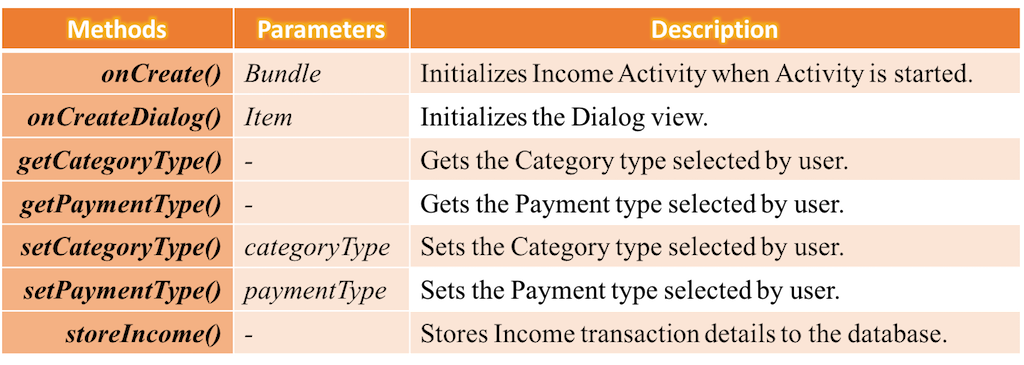
IncomeActivity - Methods
ExpenseActivity - Attributes

ExpenseActivity - Methods
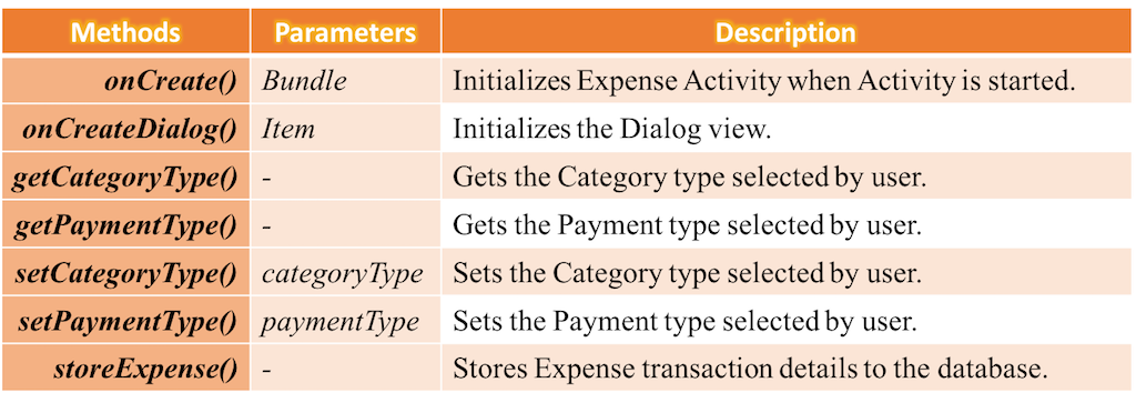
Transactions - Attributes
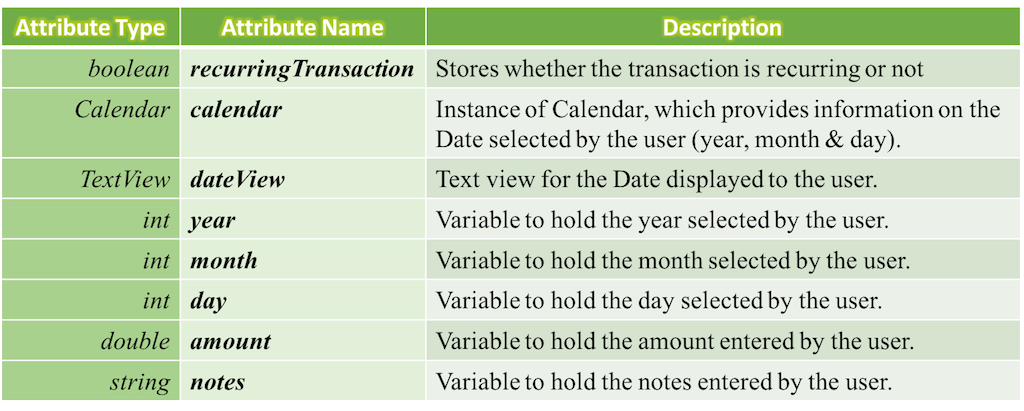
Transactions - Methods
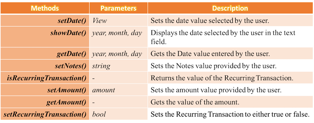
SettingsActivity - Attributes

SettingsActivity - Methods

FilterTransaction - Attributes

FilterTransaction - Methods

Log-inActivity - Attributes

Log-inActivity - Methods

SQLDBHelper - Attributes

SQLDBHelper - Methods

Design Pattern
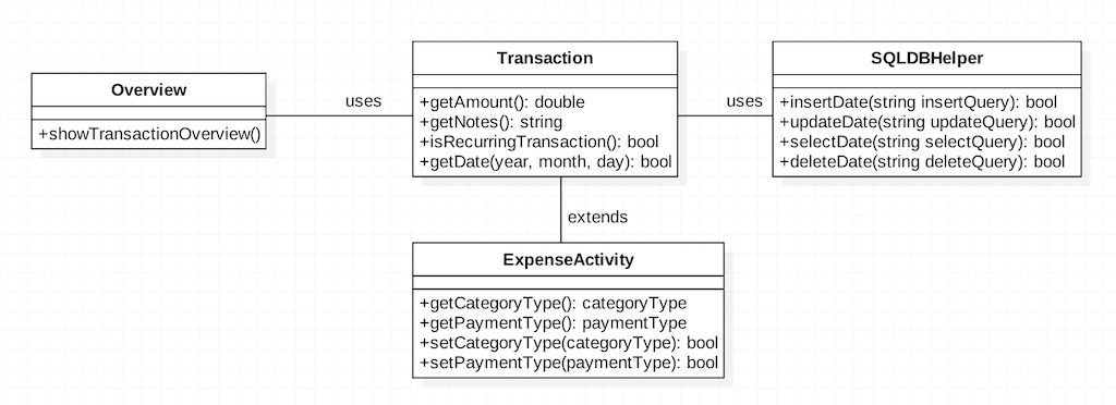
Design patterns are commonly used solutions that can be used again for solving repetitive complex software problems. We have decided to follow the MVC pattern for future progresses. One of the examples is illustrated below:
Reasons for choosing Model View Controller Design Pattern:
-
Decoupled and Reusable Code.
-
Easy Debugging.
-
Making architectural decisions becomes Easier.
-
Easy adaptation for the changing Environment.
For Example if user wants to add one more component to the start screen then only the classes in the “view” section need to be changed to adapt the new requirement.
Example Usage In our Implementation:
Development strategies
According to the SCRUM’s founder “the team is utterly self-managing”. The process of Development involves the below Work Flow.
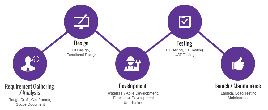
This will have to be monitored in number of ways where in each person in the team makes sure that he/she completes their task which has been assigned to them and also makes sure that they continuously monitor the team’s overall performance. This makes sure that there would be no discrepancies in the later stages and also would help maintain clean SCRUM methodology.
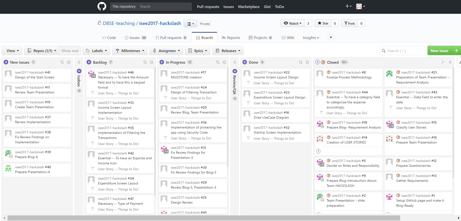
To Keep a Track of all the work which has already been completed, those which are in progress and also which are yet to be implemented we use ZENHUB dashboard. This is more sufficient way to know the progress of the project.
Summary of Changes
We have been following our initial plan to make sure that we accomplish all the user requirements which we proposed. We met the customer in person and discussed about our implementation plans and also our initial step towards developing the application. After he reviewed our application, he provided us his feedback and asked us to make few changes which are listed below:
-
Currency Type should be represented as three letter word. Ex: EUR,ASD.
-
The notes section would rather be a text field which should be able to show maximum of 250 characters or atleast 4 lines.
-
Add “+” / ”-” sign near the amount entered for Income/Expense Activities.
-
The filter options would be rather be in “Settings” than in the “Menu”” since this would again depend on the customer. This can be used only if he wants to filter the expense/income accordingly with respect to different categories or the date or might be with respect to the income type.
We are now more inclined towards making our final product a successful one and also would consider the above feed back and would work on it accordingly.
That is all for now !
Thank You for visiting our Third blog!! Stay tuned for our next blog.