Nullfinders blog on Requirement analysis of the fintrack app. We have been working on gathering requirements from the customer and formulating user stories for the same. We have pinned down use case diagrams for the modules used. An indepth view on our forecast of our development has been shown here.
Overview
- Requirements
- User Stories
- Income Module
- Expense Module
- Report Module
- Settings Module
- Use case diagrams
- Forecast of development
- Requirements gathering
- Formulating user stories
- Analyzing the requirements
- Mapping requirements to user stories
User stories
As a user I want these three main modules in the app,
Income module
Expenses module
Transactions module/Report module
Income Module:
The Income module should contain the below fields to update my income details
Data field(The date field should be the current date by default, on clicking the date tab it should pop a simple and clean calendar window)
Category(The category should be a drop down list and also an option to add additional category)
Text field (It can be of max 140 chars to give a description about the entry)
Number field(should take only numbers and the default currency will be euros)
Expense Module
The expense module should contain the below fields to update my expense details
Data field(The date field should be the current date by default, on clicking the date tab it should pop a simple and clean calendar window)
Category(The category should be a drop down list and also an option to add additional category)
Text field (It can be of max 140 chars to give a description about the entry)
Number field(should take only numbers and the default currency will be euros)
Transactions Module/ Report Module
As a user I want a report to view the details of the transactions carried out. By default the module should show the Amount balance/Amount spent on the current month.
The report also should be in the form of charts where I can have options to filter on expenses, income, on particular category, on particular payment method. Also report on weekly, monthly, and annual report.
Amount balance (Default) Filter options on the top The report details should be in the format as below(category to be added later) Date Description Amount
As a user I want the income in blue and expenses in red and also remaining balances in the end
Settings Module
There should be settings Menu for more personalized usage
Privacy
Category add/del
Auto pay
Add payment options
Feedbacks
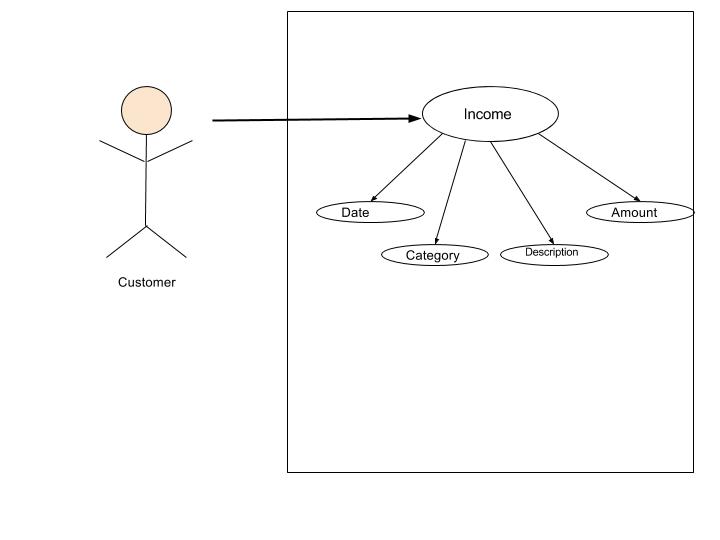
Use case diagram Income module
Title: Income module
Abstract:Customer logins to the app and enters the Income tab
Actors: Customer
Description of process
By default the current date will be in the date field.
The user will be able to add the income by entering the date, category, description, amount.
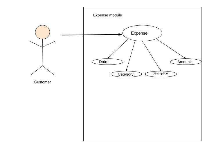
Use case diagram Expense module
Title: Expense module
Abstract:Customer logins to the app and enters the Expense tab
Actors: Customer
Description of process
By default the current date will be in the date field.
The user will be able to add the expense by entering the date, category, description, amount.
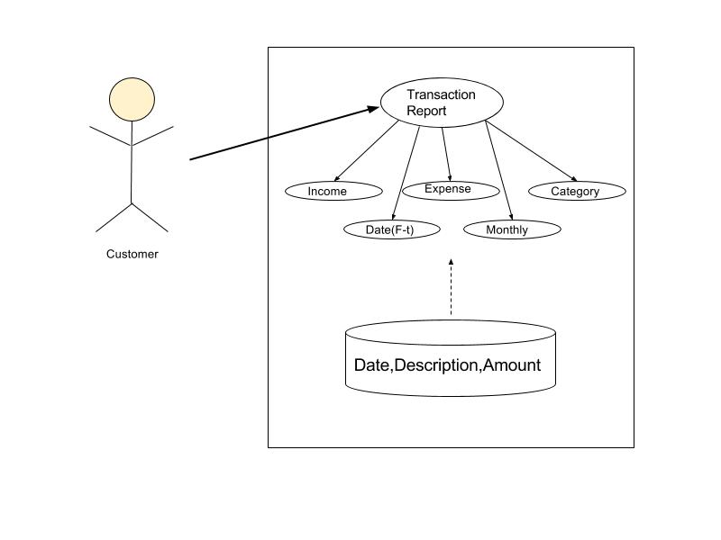
Use case diagram Transaction Report
Title: Income module
Abstract:Customer logins to the app and enters the transaction report tab
Actors: Customer
Description of process:
By default the amount spent for the current month will be displayed.
There will be filters on income/expense, date,category.
Forecast
We created user stories to achieve the basic functionalities on the App. Such user stories are a part of very fine distribution of chunks of tasks. The Agile methodology states the following process flow:
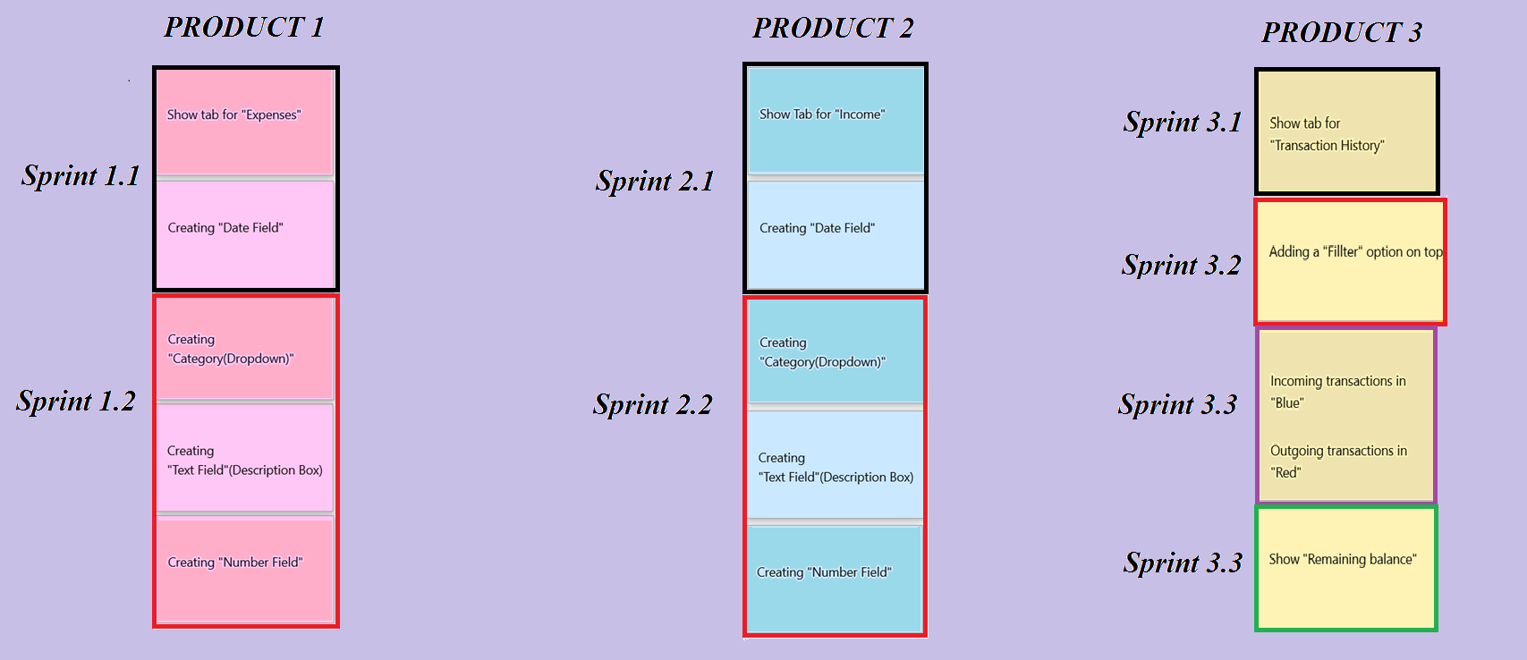
Factors we considered when assigning sizes to a story: complexity, effort, and doubt.
For e.g.: If you assign 3 points on a story, find a 1-point story nearby and assess whether this story is really 3 times as complicated as the smaller story.
Here the story sizing has been done based on Fibonacci Series approach where the series look like this: 1 1 2 3 5 8 13… and so on.
Product Forecast
This is a overall forecast of the product from requirement gathering to final launch of the product.

Requiremets Gathering
Requirements were gathered at client meetings held once every week. At these meetings, initially a very high level design was discussed. At subsequent meetings, a more detailed plan was shared. Our team of Developers, Design Experts, Testers and Scrum Master left no stone unturned in understanding the needs of the Client. A clear picture of the product was potrayed at the second client meeting wherein the basic needs of App pages were discussed. “Nice to have” features were also jotted down. These sessions witnessed some good exchange of ideas between the client and the team. The team shared a few roadblocks, and they were addressed accordingly. Post meetings there were additional team exclusive meetings wherein all difficulties and obstacles were shared with the scrum master. The scrum master took these issues up with the Product Owner.
Analyze
Our team divided the requirements stated by client into three collumns, namely
- Basic Requirements
- Must have features
- Nice to have features
Talking of basic requirements, here page screens of the App, typical options for users, navigations were discussed. Must have features are features that can be setup on the screen but later. One such example is the contact button so as to let the customer communicate with support team in case of troubleshooting. And finally comes the “Nice to have” features like password protection for the App user, Reminder option, etc. Such requirements were jotted down and will be implemented into system design once the basic module is up and running.
Mapping user stories to requirements
Requirements were analyzed and categorized into blocks as mentioned earlier. The team took up their respective domains and started working on their respective frameworks once the tasks were assigned. At the team meetup, detailed light was thrown on requirements and a fine breakdown of the same was done. This was done primarily for User Story build up. A very fine breakdown of tasks were done and assigned to developers and this enabled us to think more clearly with respect to requirements. Using Zenhub in Github, we were able to put milestones. User stories were divided based on the options that would reflect on the App ́s first page.
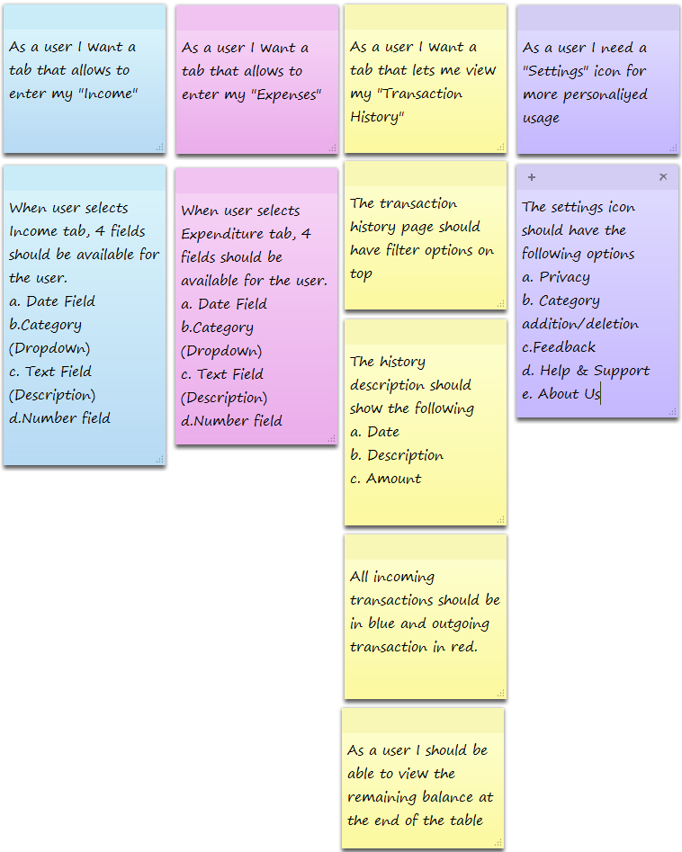
- The “Income” tab
- The “Expenses” tab
- The “Transaction History” tab
- A special “Settings” option, to allow the end user more personalization while working with the App
Here is a product of our brainstorming session.
Tackling wrong assumptions
When the customer or user asked us to maintain the project and its categories to be small and precise, we later took outselves into the project and overlooked it then we came up with the idea that if the new information is uncovered that will change the scope of the project and its reachability, later we made it bigger with the latest trends in information.
Relative to the above mentioned assumption the user/customer did not mention about the social platform of the project and We as a team discussed about this and added social platform to the project as it is a proven powerful media thus it will reach out more to the people.
While we were in a continuos discussions of the project the user/customer proposed single language resource platform for the users of the application, As we are mentioined the application is wide spreading and it would also be used by so many people across the world we came up with multi language resource platform this will make the users to switch to their comfortable languages.
