Coding Conventions
Coding conventions improve the readability of the code. Therefore it is very important for us to adhere to some standard coding conventions. This project is in line with the standards provided in the Google Java Style Guide.
1. Java file names
All the class and interface files must end with .java extension and have only one class.
2. Source file structure
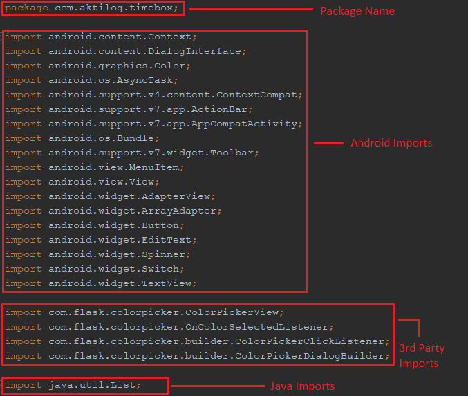
All the source files should have:
- License or copyright message
- Package name
- Import statements (Android statements, third party statements, java/javax statements)
- One high level class
- Overrides of methods
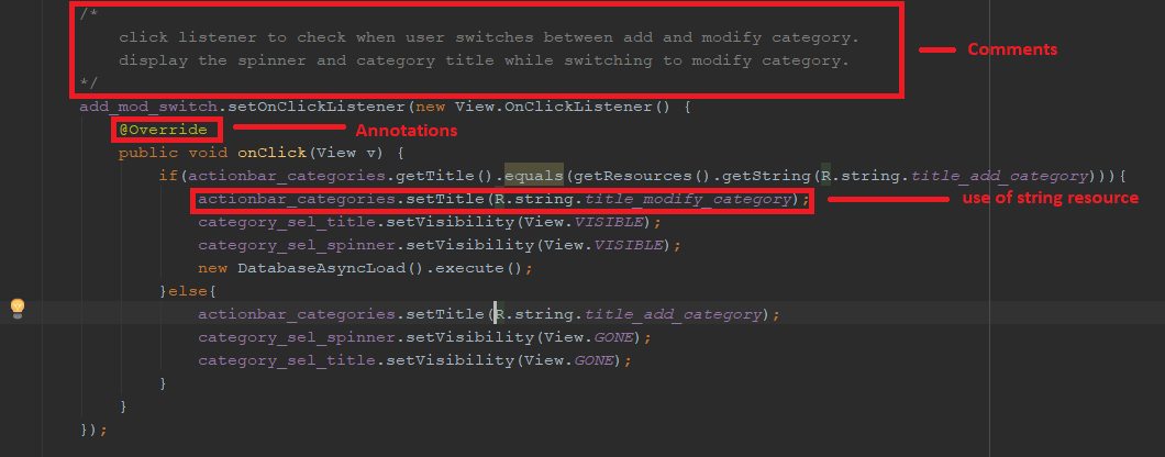
3. Comments
All the source files must have comments for each section.
4. Variable declarations
Every variable declaration should have only one variable.
5. Annotations
Every annotation must appear right after the comment block and before the corresponding class or method. There should be only one annotation per line.
6. Naming Conventions
- Java Classes/Interfaces:
UpperCamelCase.java - Activity Java Files:
UpperCamelCaseActivity.java - Activity Layout Files:
activity_lowercase_name.xml - Fragment Files:
fragment_lowercase_name.xml - Menu Files:
menu_lowercase_name.xml - Method Names:
lowerCamelCase - Constants:
UPPER_CASE - Variables:
lowercase_name
7.Miscellaneous
- All strings should be used from the strings.xml file using
R.string.string_name. - All colors should be used from colors.xml or android/colors using
R.colors.colorsNameorandroid.R.colors.colorName.
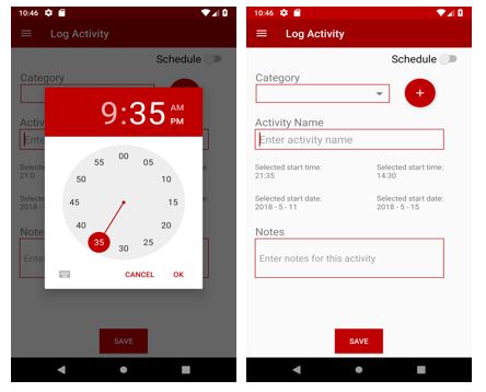
Sample Screenshots:
Context of use
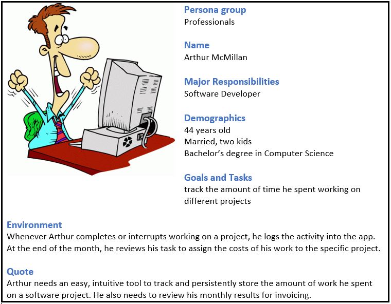
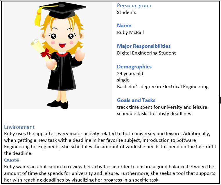
In order to identify the major needs and expectations of our users and, thereby, define the key functionalities of our app, we have created two different personas which represent the major user groups for our software application. The purpose of personas is to create reliable and realistic representations of your key audience segments for reference and our approach to obtain personas, from which we can extract as much meaningful information as possible, was to ask us the following questions:
- What is the highest level of education this person has received?
- How much work experience does our person have?
- What is our person’s professional background?
- Why will they use our application?
- When and where will they use our application?
- What are his/ her needs?
There are some more questions which are related to creating a good persona, like which gender and age does our person have or which technical devices does our person use on a regular basis. Since the answer to those questions do not influence our key audience segment in their usage of our app, we let them unanswered in the following created personas:
Design Solutions
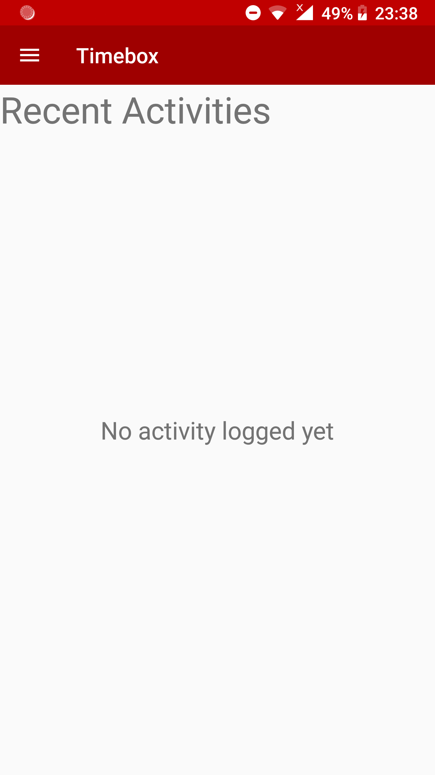
After researching those contexts of use created above, we create a prototype of the UI design focusing on the user’s need
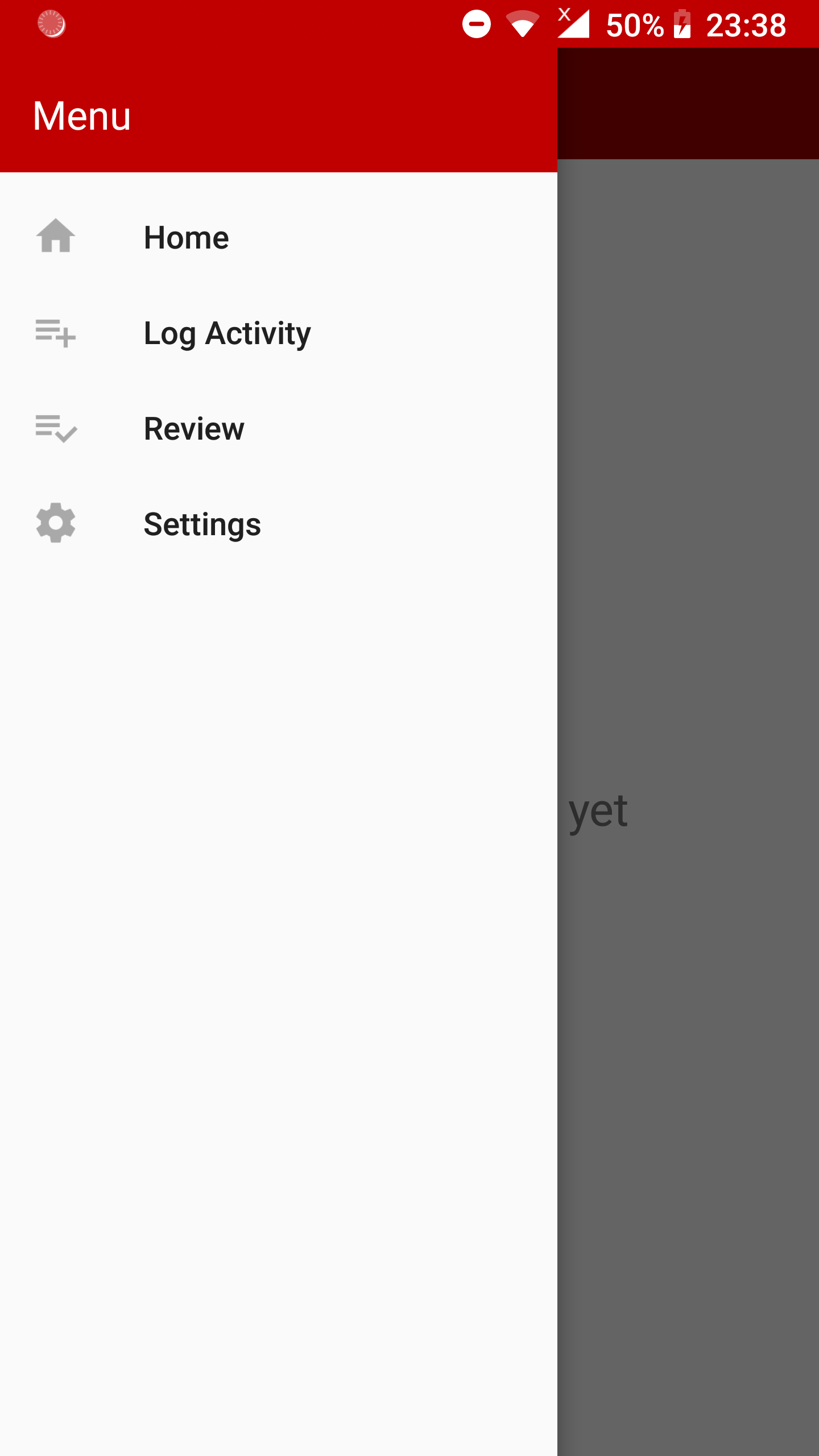
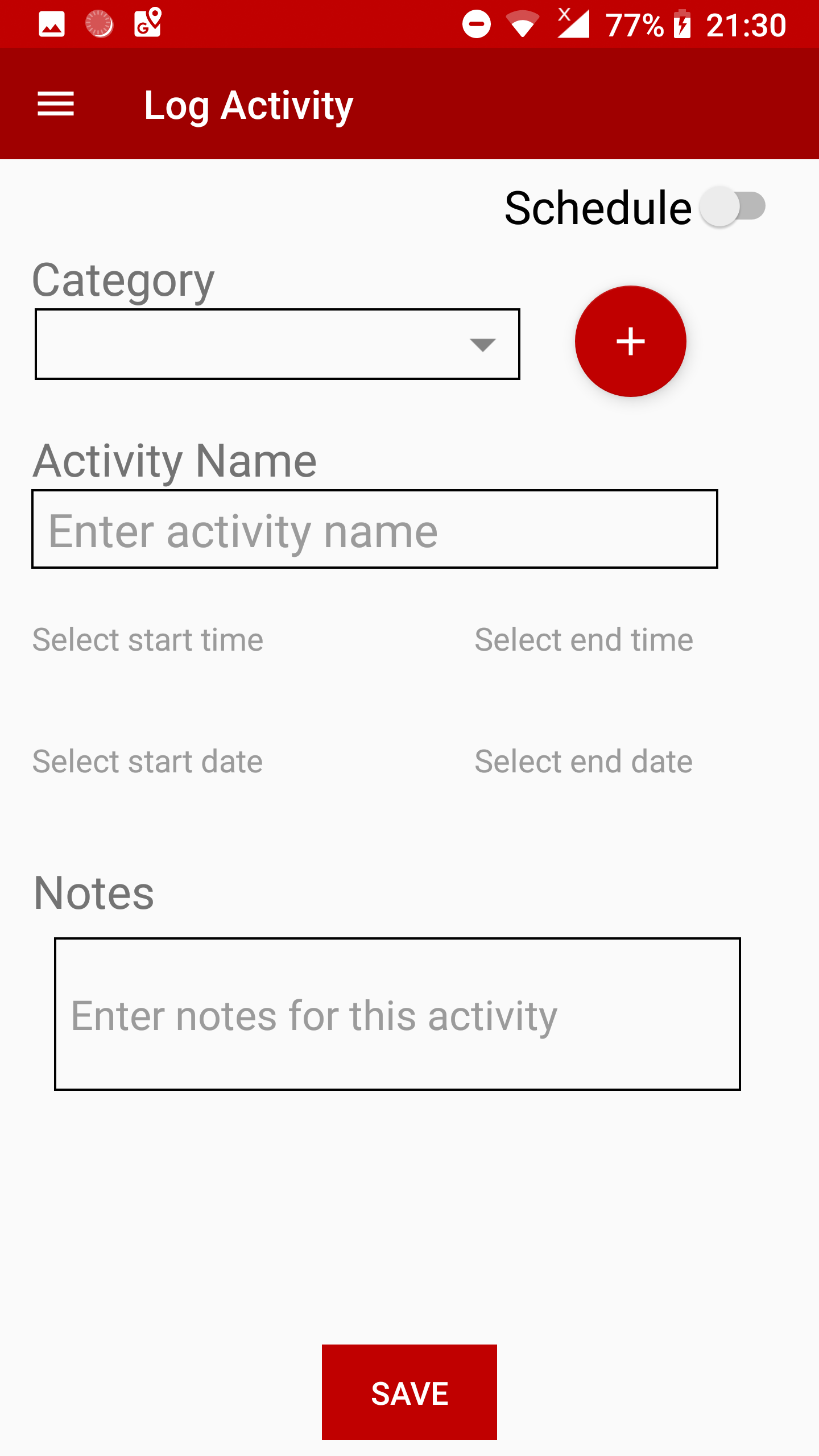
1. Log Activity Screen Sequence
 |
 |
 |
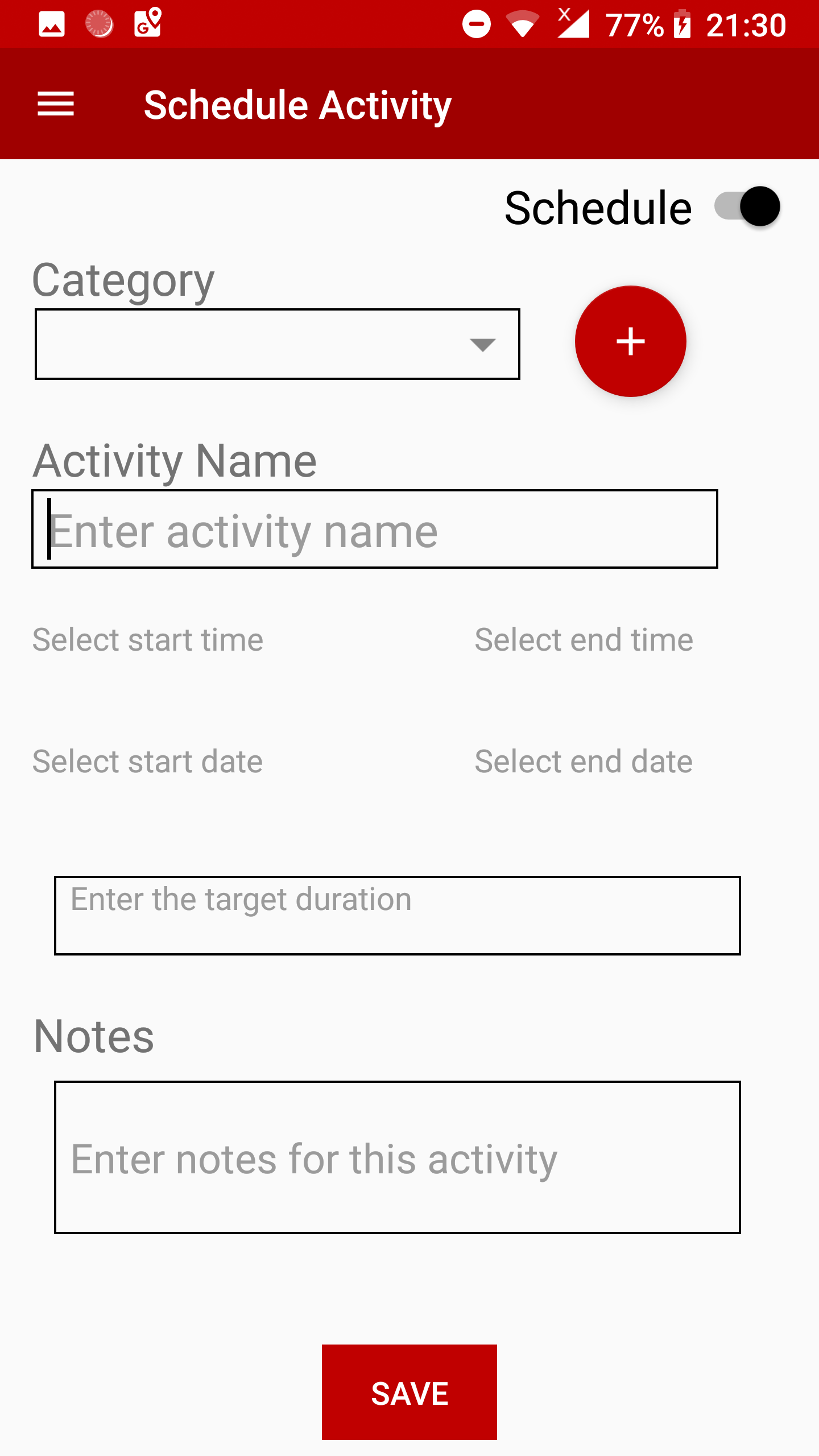 |
The Navigation is very simple with wiping and switching of button, and fast with four screen at most for all functions.
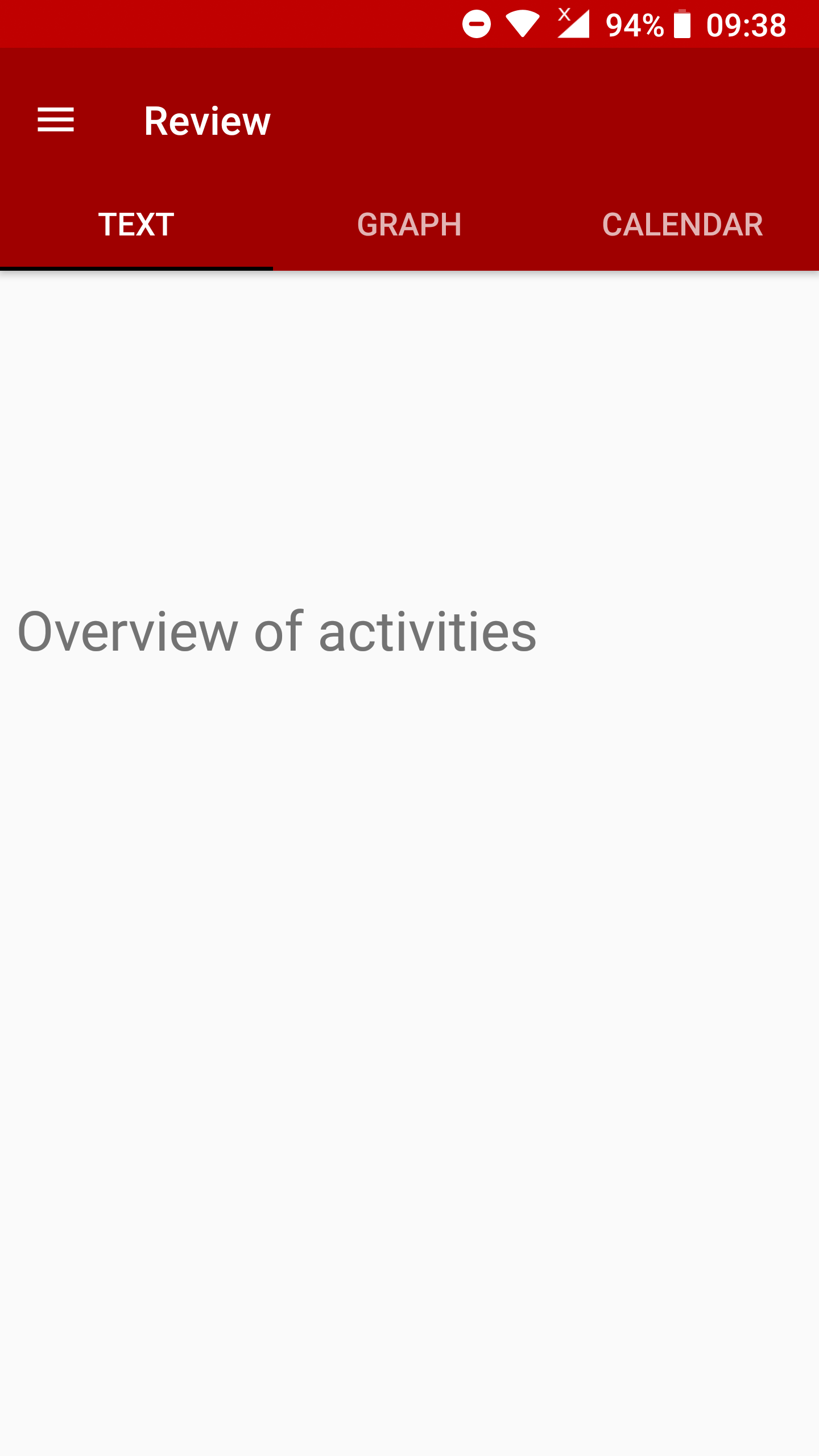
2. Review Activity Screen Sequence
 |
 |
 |
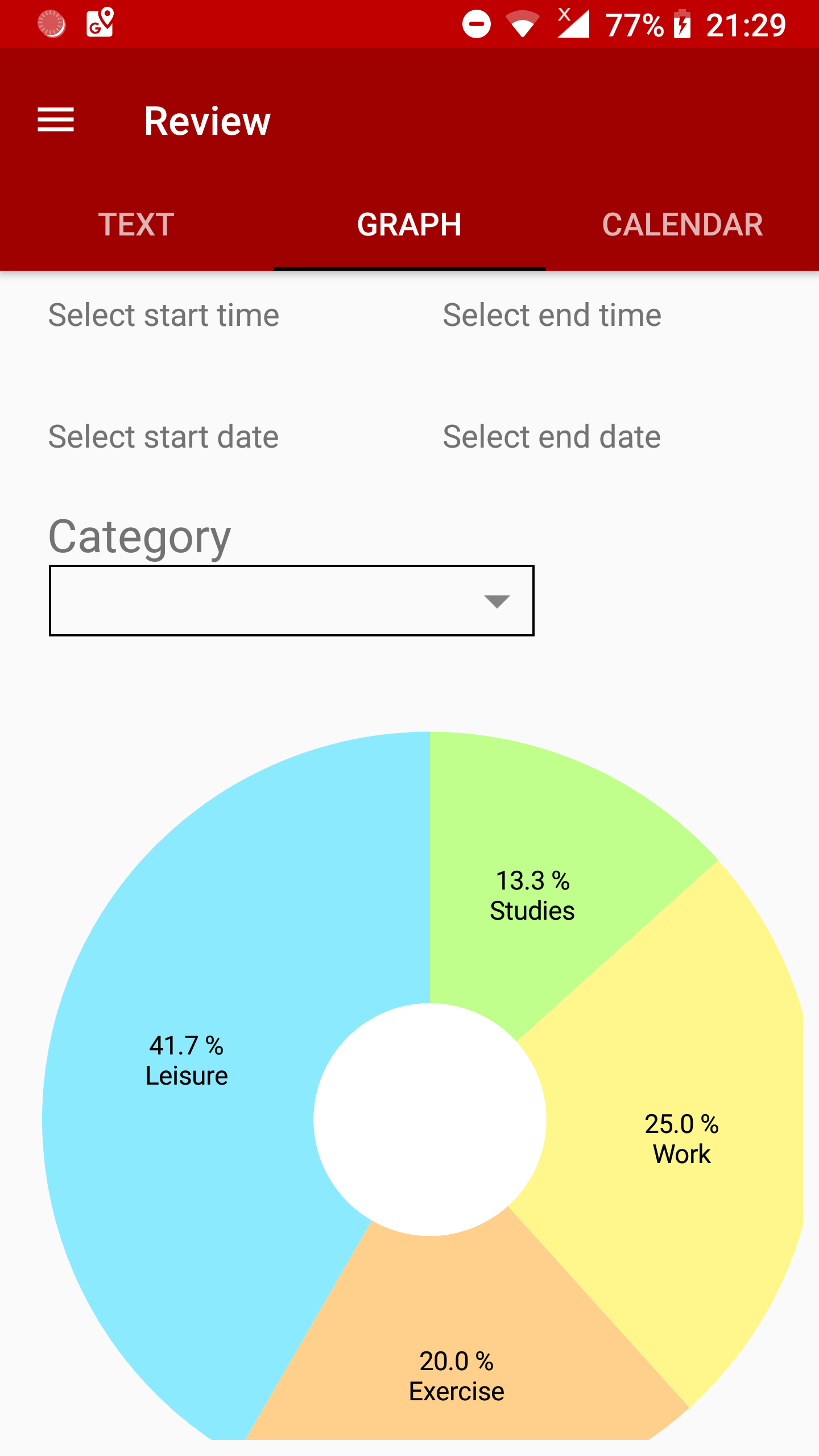 |
By using enforced element like drop-down list and button, errors are prevented.
3. Home Screen Design
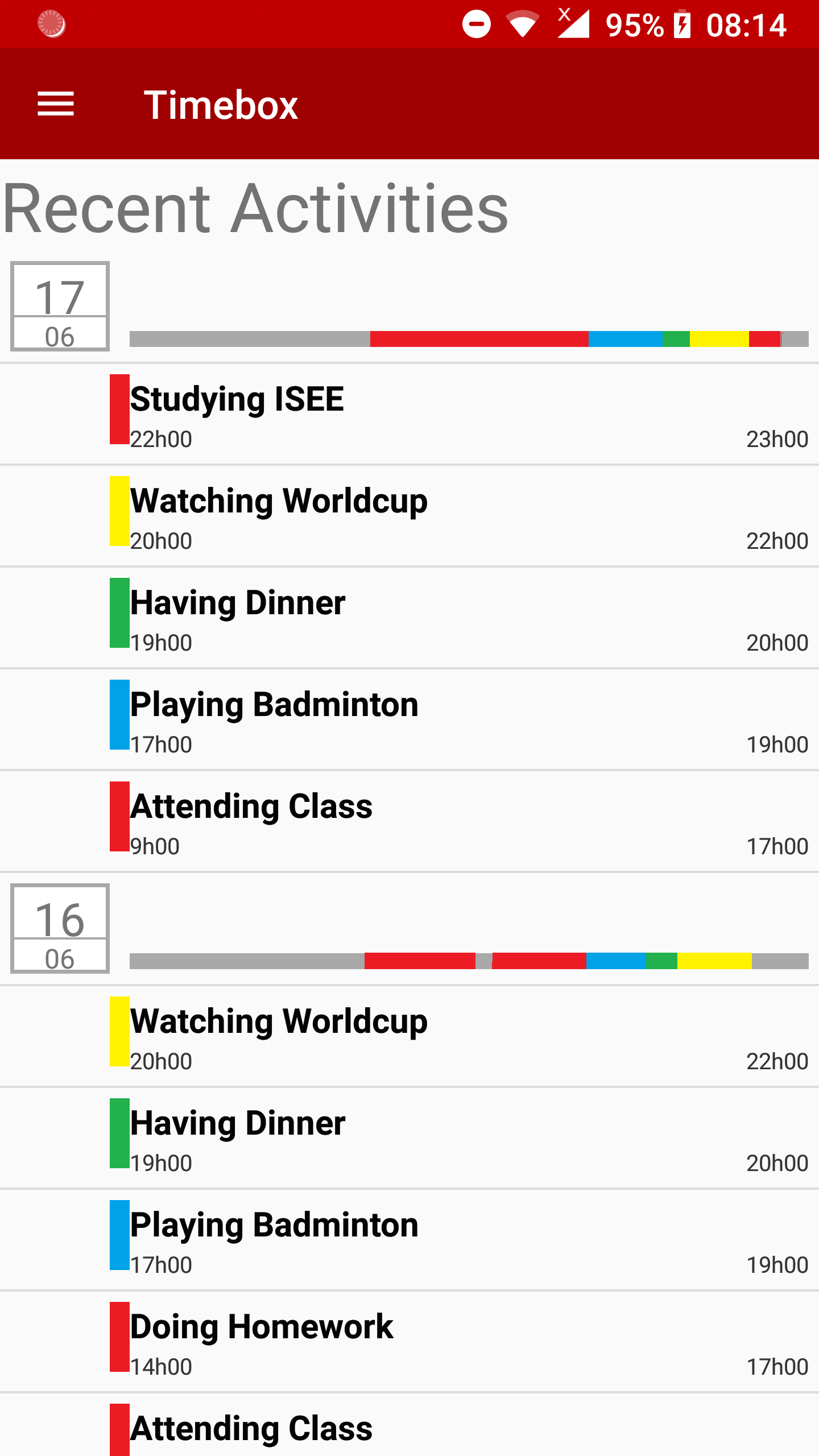
- Items are grouped automatically by day
- The header row could help indicating the workday pattern visually
4. Graph Review Screen Design

- Combining 3 default filters, the user can create a report suite his/her own needs.
- The graph review is ideal for an overview of categories
Summary of Changes
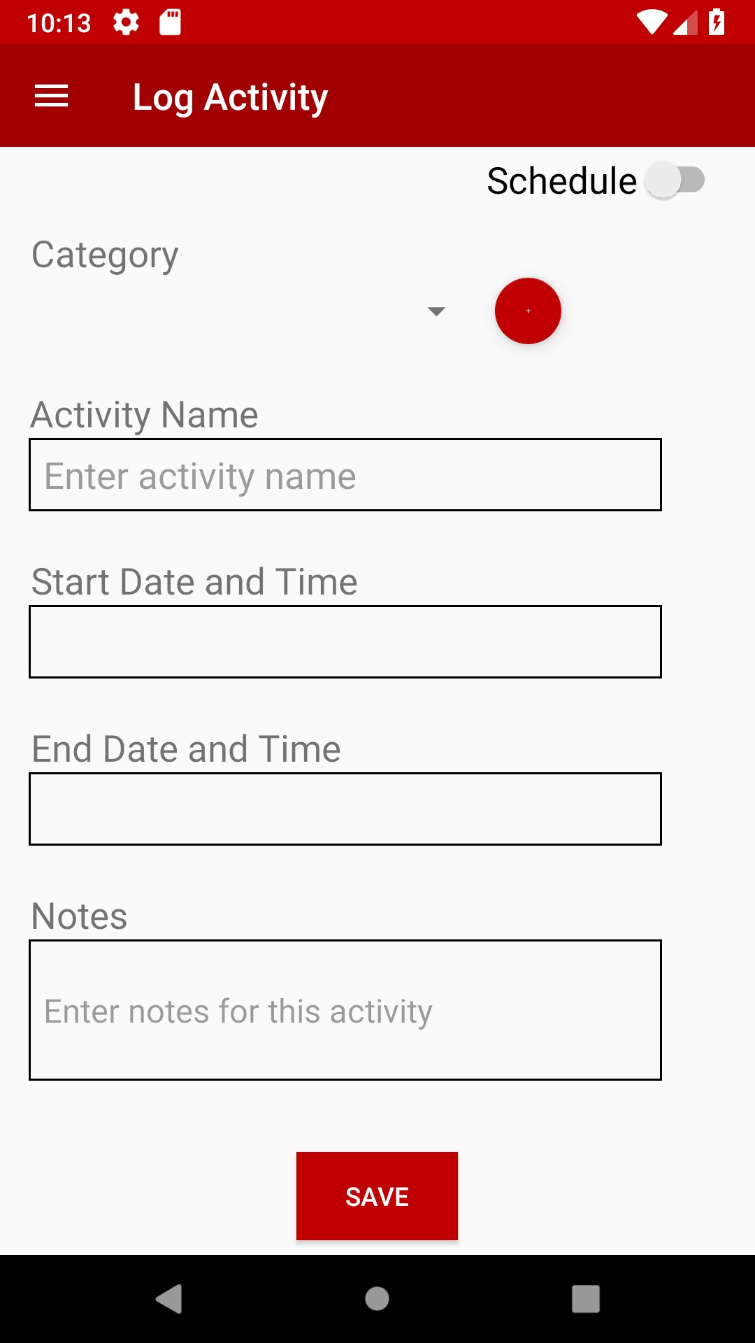
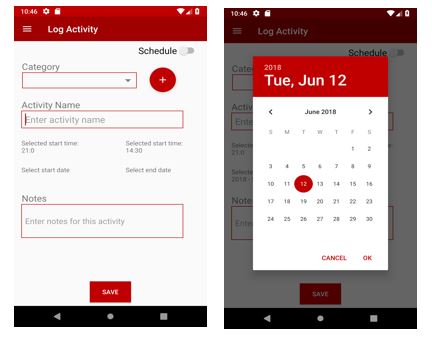
In comparision with the initial design, we have made few changes to the user interface. We started with a simple design for logging/scheduling an activity, which allowed the user to enter the dates and time manually.After the lecture on “User interface design” we understood the importance of having a UI which will satisfy certain functional,psychological and aesthetic criteria.we also want to ensure that we do not get unexpected user input, which is enforced by using UI elements such as Date and Time Pickers.
Old Design: Log activity
New Design: Log activity
Another key change in our app is on the review page, where we show a graphical representation of all activities.Our first design showed filter options based on either start & end date or categories which was practically not correct. However, after clarifying with the customer, we are designing a review screen where the user can choose start & end date and select few or all categories. The graph will display the percentage of categories for selected time period.

